Digging around for something else, this caught (and delighted) my eye:

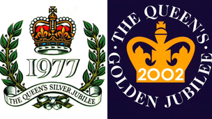
Compare the energy and charm of this with the logos for her previous jubilees:


,,,but seriously, don't they make you yawn just a tad in comparison to Katherine Dewar's design? A bit stuffy, a lot safe...
The Diamond Jubilee logo also comes in a Welsh version:

Seeing the threee together also gives a neato snapshot of design styles and fashions over this period; no way anything as Establishment as the monarchy would have countenanced Katherine Dewar's design in 1977.
What do you think?
ADDED LATER: I've used this image to make a counted cross stitch chart (the English version and the Welsh version). It's free. Read all about it and get the links at this blog entry.
Image sources:
double jubilee logo
silver jubilee logo
white bg golden jubilee logo
diamond jubilee logos
No comments:
Post a Comment
All blog comments are moderated (to catch spam). If you don't want your comment published (eg. you';re including an email address) then please indicate that. Your links, ideas and (copyright free) images are welcomed - I'd like this site to be as comprehensive as possible. Thanks!